Designing for the Device in Hand: Why Mobile Matters in E-learning
In the Palm of Your Hand
Depending on where you are in the world right now, there is a 50 to 65% chance you’re reading this article on your phone or another mobile device. The traditional picture of someone typing away on a laptop is quickly changing as we pull out our phons and tap and scroll and swipe. In much of Sub-Saharan Africa, smartphones are the only way people can access the internet. We’re part of the online world through what we hold in one hand. It’s a big privilege to be this connected, and an even bigger responsibility to make sure access is meaningful and inclusive.

This global shift has prompted discussion about how to meet traditional learning needs using modern technology. The E-learning field has been as affected by this as other sectors. So, it’s worth taking a good look at the differences between mobile and desktop delivery and see whether we need to change our design approach to improve our learning experiences.
The case for Mobile
The first thing you may be wondering is whether you need to take mobile devices seriously as a way to deliver learning. Many people still think of phones as backup devices for e-learning—something we use only when we’re not at our desk. Do you really need to go to a lot of trouble to design for mobile when it’s not the main point of access?
Well, there is a very strong case to be made for mobile as the primary device in Sub-Saharan Africa. Here are statistics from two reliable sources:
🟢 GMSA 2023: 527 million unique mobile subscribers, 320 million mobile internet users in Sub-Saharan Africa.
🟢 PEW Research 2018 (South Africa): 9 in 10 adults own mobile phones; 51% own smartphones.
Though these statistics are a few years old, there is no reason to believe that they have dropped in any way. Simply put, the market for e-learning already has mobile devices and they are unlikely to have the cash to invest in a larger piece of equipment. Since smartphones became widely adopted around 2010, annual sales have flooded past a billion units and continue to rise.
Considering that mobile is the primary or only access for learners in areas with fewer resources, the result will be that content that’s not designed to work on a phone risks excluding a large section of learners.
Design Considerations:
As instructional designers we are highly aware of keeping our e-learning content walking the fine line between engagement and distraction. We’ve traditionally used the extra space provided by larger displays to include complex diagrams, multitasking tools, and longer videos or simulations. We can add interactive features like drag-and-drop activities or branching scenarios. The UX or user experience has been adjusted and streamlined to keep learners focused on the content, giving them what they need to know. We’re aware of cognitive load and how to overcome it, and we use tools like gamification to keep things engaging.
So, how do we rethink our approach for mobile learning?
In his excellent presentation for Google Conversions in 2014 digital product designer Luke Wroblewski, writer of the seminal book Mobile First, makes the point that back then we were locked into the ‘PC’ view for our display area. Obviously, smaller screens mean losing a lot of display space. The default was to make web pages vertical, with the user scrolling and scrolling through what used to be on a regular web page. Was it a good user experience? No.
Making a good user experience means acknowledging that small screens need clear, focused content. Wroblewski’s insight was that one of the hardest parts of mobile design is figuring out the right time and place for an action, or in our context, the right position for our key learning objectives. We want to put the key content top and centre, not buried halfway down an apparently endless scroll.
We need to separate primary content—what the main focus is, from secondary content—what can be put into side bars or context menus.
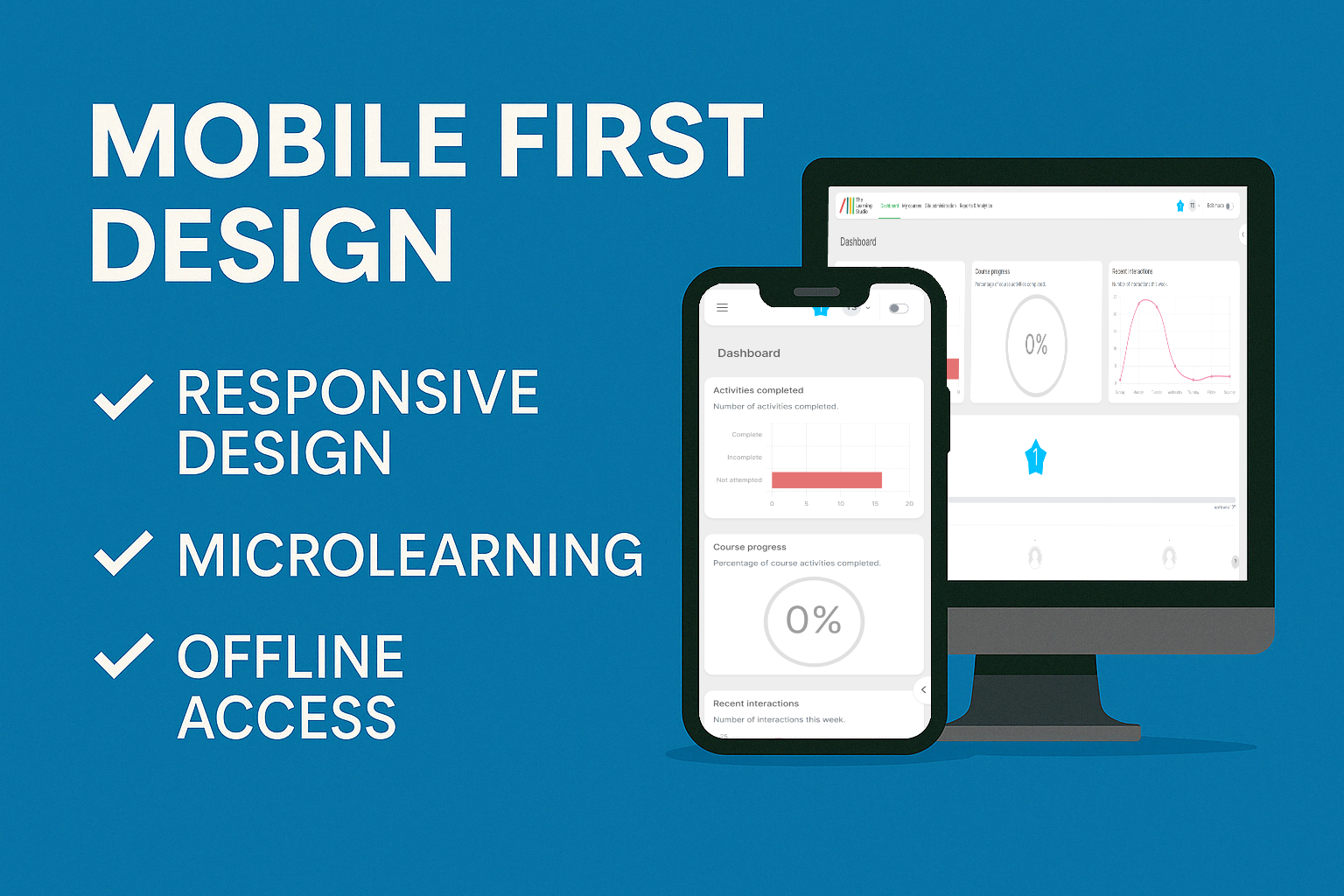
And because many learners use mobile in low-bandwidth areas, we should build in offline access and use compressed media to reduce data use. We also want to make good use of Microlearning—short, focused learning activities which helps keep learners engaged.
Last but not least, we want to learn about and use Responsive design. This is a web and interface design approach that ensures content automatically adjusts to fit different screen sizes and devices. Whether you’re using a smartphone, tablet, or desktop, responsive design rearranges layout elements, resizes text, and optimises navigation for each device.
All this brings us to a Mobile First approac
Mobile First Design

What does this mean for e-learning designers, builders and developers? From a purely practical viewpoint, we want to create learning that is accessible on whatever medium the learner is using. We don’t want screen size, finger size, limited input options, glare, and connectivity and performance issues to disrupt or interfere with learning.
Mobile-first design is an approach where digital experiences are created starting with the smallest screen and simplest functionality in mind—typically smartphones with limited bandwidth—and then scaled up for larger devices. This means we focus on essential content, performance, and usability from the start.
For e-learning, this means designing lessons and interactions that load quickly, work on smaller screens, and function well even with weak internet connections. The benefit? Learners can access content anywhere, anytime, without needing a fancy phone or fast Wi-Fi.
Moodle’s Mobile App:
How does Moodle approach this concept?
Moodle released the first version of its mobile app in 2012, with the official app launching in 2013. Since then, it has added a wide range of features to enhance mobile learning. Learners can use the app offline to access content and its responsive design ensures that course pages, quizzes, and resources adjust smoothly across various screen sizes.
Importantly, the app works in low-bandwidth environments, making it particularly useful in rural or resource-constrained areas. It’s a powerful example of how a platform can shift
from a desktop-first experience to one that meets the needs of mobile users without sacrificing functionality or learner engagement.
Conclusion:
There’s so much more to talk about around this topic. What are the challenges and trade-offs that come with designing for both desktop and mobile learning? How do we ensure that we are still designing for how people learn and not just devices? Watch this space! We’ll continue our discussion in the next blog.
Kerushan Naidoo
Head of Moodle Development
Kerushan has a decade of experience working wonders with Moodle. That’s why we rely on this man for the winning plan. He is an active Moodle community member and, either knows of the perfect plugin for your needs, or will customise and develop a plugin to meet your unique requirements.
