Mobile vs Desktop – Striking the balance between delivery design methods
Understanding Mobile-First Design in E-learning
The previous article in this series talked about why we need to focus on designing e-learning for mobile devices. If you still need convincing, here’s another compelling statistic: According to Statista’s 2023 Digital Education Outlook, 71% of learners now access educational content on mobile devices at least weekly, yet a Brandon Hall Group survey found that only 36% of organizations design their e-learning with a mobile-first approach.
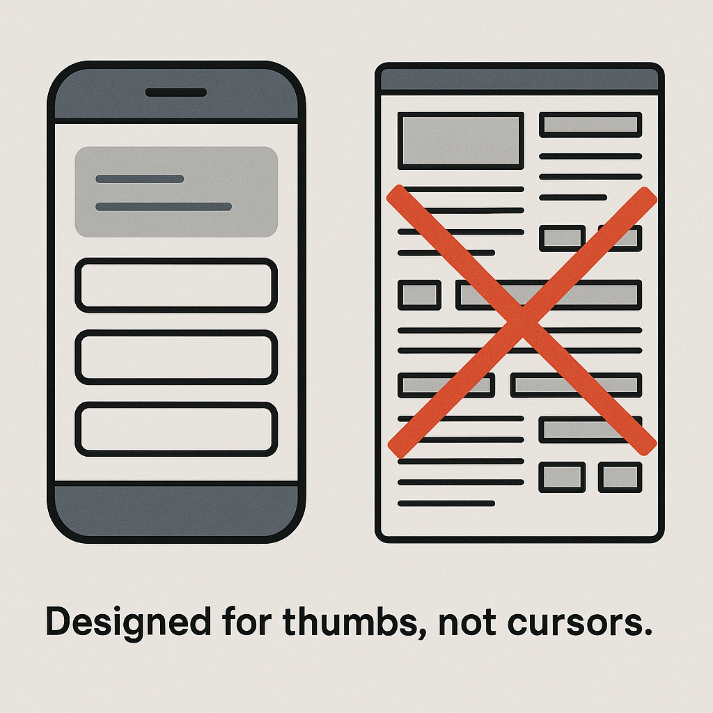
This disconnect shows we’re missing the mark. Learners are reaching for their phones, while many courses are still built for laptops. To truly connect with today’s learners, we need a change in thinking: start by designing for the phone in their hand, not the computer on a desk.
Now that you’re entirely convinced that Mobile-First is the way to go, let’s talk about how to do it.
The Basics of Mobile-First

We have to turn the design process on its head. We build for smartphones and offline capability first and scale up to fancy desktop versions later. Of course, this means that we have to make smart choices about what really matters right up front. Mobile design guru Luke Wroblewski says: “Losing 80% of your screen space forces you to focus. You need to make sure that what stays on the screen is the most important set of features for your customers and your business.”
The benefits are huge: your courses load in a flash, they are accessible anywhere – the bus or the boardroom, and the user experience is spot on.
It naturally pushes you toward bite-sized learning chunks that don’t demand an hour of uninterrupted focus, navigation that doesn’t need a map to figure out, and text that won’t have your eyes begging for mercy. When you design mobile-first, you’re basically creating learning that works anywhere, anytime.
When to use Mobile and when to use Desktop
There are times when using a desktop has its advantages. The table shows when it may be appropriate to adapt according to the content you are presenting. But it also shows that there are very few situations where the desktop should be favoured at the expense of mobile-first.
This is particularly true when preparing e-learning for adults. Mobile ticks most of the boxes for how adults prefer to learn – concise, on-the-go, microlearning, focused.
| Factor | Mobile Design | Desktop Design |
|---|---|---|
| Screen Size | Small screens → use concise content, large tap-friendly buttons, vertical scroll. | Larger screens → allow for detailed content and complex layouts. |
| Connectivity | Often used in low bandwidth areas → provide offline access, compress media files. | Stable connections → can support media-rich content like HD video and audio. |
| User Attention Span | Shorter sessions → ideal for microlearning and gamified activities. | Longer engagement → suitable for in-depth learning and extended simulations. |
| Interaction Style | Touch-based → design with simple navigation and swipe/tap gestures. | Keyboard and mouse → support drag-and-drop, typing, and multi-window tasks. |
| Content Complexity | Focused, bite-sized content that’s easy to digest. | More complex content with room for branching, case studies, and assessments. |
| Learning Context | On-the-go learning, quick refreshers, or performance support. | Structured learning, assessments, deep-dive modules. |
Balancing the Two: Finding the Sweet Spot

Do you have to build everything twice to make sure that your e-learning works for both options? Not at all! As learning design expert Julie Dirksen points out in her book Design for How People Learn, what matters most isn’t the device but how people’s brains actually absorb information. She reminds us: “Good learning design starts with understanding how people learn, not with the latest tech.” When you design with that in mind, the importance of making the experience clear, useful and engaging come sharply into focus.
This is the time to deploy responsive design and progressive enhancement. The trick is thinking in flexible building blocks rather than rigid pages. Think of your content like Lego pieces that snap together differently depending on the screen. Start by figuring out what’s absolutely must-have versus nice-to-have, then arrange everything in importance order – this way, the essential stuff always gets prime screen position. Absolutely critical at this point is to test, test and test again how the content looks on different screen sizes. Tools like Articulate Rise 360, Adapt Learning, and Lectora make this process easier by supporting responsive design right from the start, they handle most of the technical heavy lifting so you can focus on the content.
Challenges and Trade-offs
Designing for both mobile and desktop comes with a few hurdles. Your smartphone just can’t handle everything your laptop can. Mobile’s small screens and lower processing power often mean you’ll need to keep content shorter, reduce complex interactions, and simplify assessments. Sometimes you’ll need to simplify – maybe swap that drag-and-drop activity with 20 elements for a matching exercise with fewer items or turn that detailed assessment into something more straightforward. Can you imagine typing a long essay question with your thumbs? Short answer questions and classic multiple choice will be much easier to manage on a phone.
Balancing both formats requires compromise. You will need to spend extra time testing and adjusting the user experience across multiple devices and operating systems. There are added costs and time investments in cross-device testing. And let’s not forget accessibility. What works on a desktop may not be as usable on mobile, so extra care is needed to ensure all learners can access and enjoy the content equally. A key point about accessibility, when you make content accessible for people with impairments, you make it accessible for everyone.
Best Practices and Recommendations
Responsive design best practices include using flexible layouts, optimising images, and employing media queries to create websites that adapt to various screen sizes and devices. A mobile-first approach, where the design starts with the smallest screen and scales up ensures that your content stays clean, focused and user-friendly. Other important considerations include prioritising content, using responsive typography, and testing on real devices. Don’t forget to optimise videos and audio so they load quickly, even with limited data.
Conclusion:
Remember, Mobile-first doesn’t mean mobile-only. Your courses won’t suffer when using this approach. Rather, mobile-first techniques actually address adult learning preferences and needs, working with the latest discoveries in how people learn. When we build flexible, device-agnostic learning experiences, we make learning accessible for all.
Kerushan Naidoo
Head of Moodle Development
Kerushan has a decade of experience working wonders with Moodle. That’s why we rely on this man for the winning plan. He is an active Moodle community member and, either knows of the perfect plugin for your needs, or will customise and develop a plugin to meet your unique requirements.
